Overview
Problem
Casual/semi-professional photographers usually take lots of similar photos of the same thing/person, and have a hard time comparing them afterwards to pick the best ones. Those highly similar photos also clutter their photo libraries, making it hard for them to later find what they want.
Solution
I designed Photo Groups, a new feature in Google Photos that better leverages its Machine Learning capabilities to identify similar photos, group them together, suggest the best ones, and facilitate photo comparison. With Photo Groups, users can clean up the clutter in their photo library, and more quickly compare the photos they take, select the best ones for further actions, and delete the unwanted ones.
Timeline
A Week
Project Info
Individual Design Exercise
Tools
Sketch, InVision Studio, Principle
Browsing without Clutter
With Photo Groups, find your best memories more quickly.
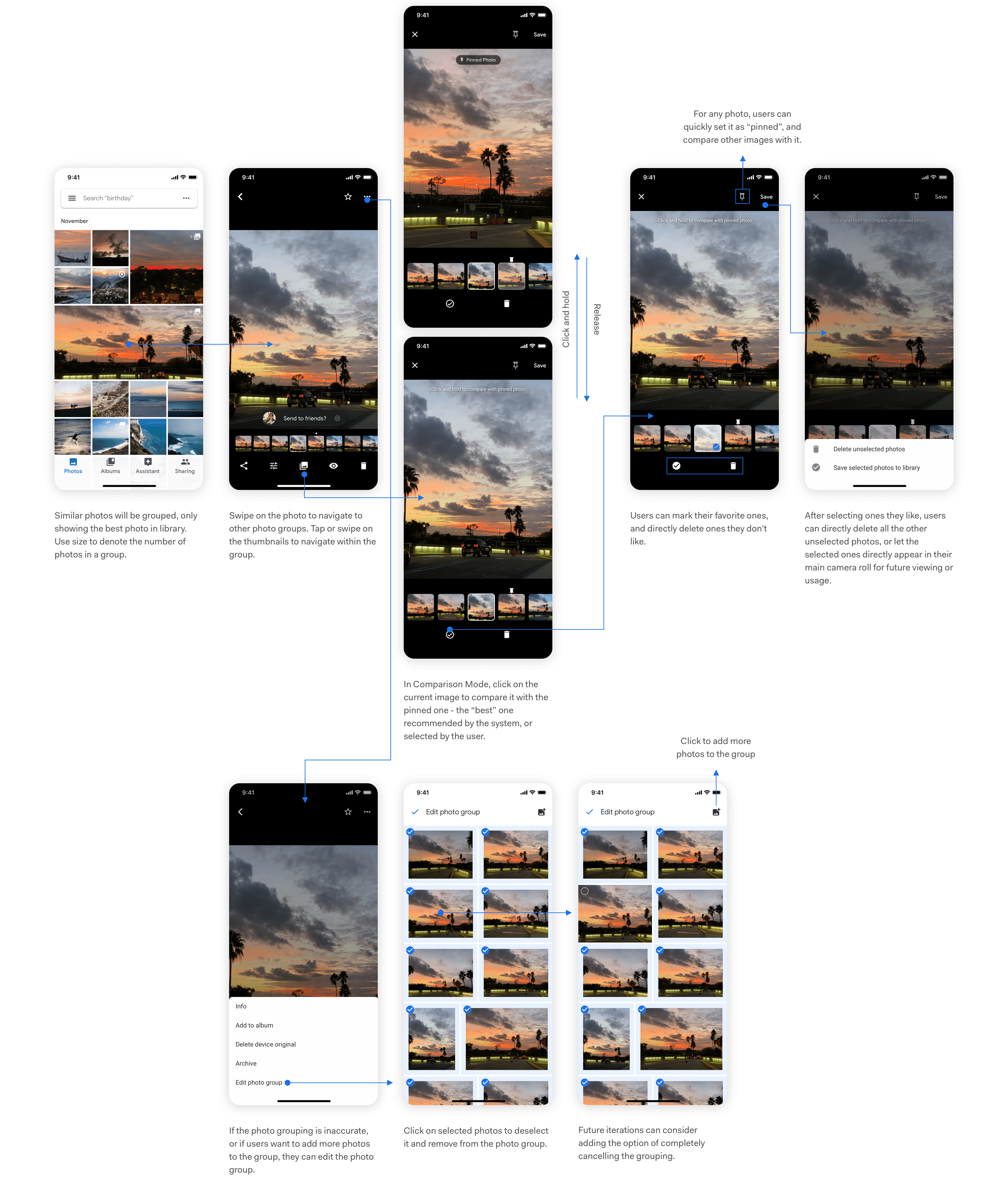
Using Machine Learning algorithms, the redesigned Google Photos automatically groups similar photos taken around the same time, and only shows the best shot in your camera roll. Browse through the best of your memories, and dive deeper to see all the images in a group only if you are interested.
Instantly Find the Best in Group
The best photo is already picked for you. Compare other photos against it without scrolling around.
We suggest the best shot for you to view or share. Not satisfied with the recommended one? The newly designed "Comparison Mode" helps you instantly see how each photo you took differs from our suggested one. Make fast decisions to mark or delete, and delete all the unwanted ones with one click.
You are in Control
Easily customize your Photo Groups the way you want.
We make sure that the algorithms do most of the work for you, but we know that sometimes, your preferences might be different. In case you don't agree with our grouping or recommendations, simply edit the photo group or change the key photo of the group to ones you like.
Research
Why Redesigning Google Photos?
I love Google Photos. As a user, I think it's my favorite app for organizing photos, looking them up, quickly sharing them with friends, and getting fun animations & collages. As a designer, I love how it leverages the power of machine learning to explore more intuitive ways for users to manage their photos, such as using natural language to search for photos instead of looking through a lengthy, messy timeline.
However, I believe that Google's machine learning technologies can be further pushed to make the photo management experience easier. A problem that my friends and I usually encounter is that when taking photos, we'd like to take a lot of them, and then select the best ones afterwards. The selection process can be time consuming and frustrating, and if we leave all those photos there, they'll soon clutter the photo library, making it hard for us to find what we want. This gave me the initial idea: what if we can rethink the way photos are presented in Google Photos, and make the selection process much easier?
Of course, if I were designing the real product, I would also refer back to the product's own target audience and the company's roadmap, to think about whether the feature is crucial for both its users and the business.
Domain Research
I first looked into the market, trying to find inspirations and gaps among existing products:
Only Gemini helps users manage similar photos, but users will need to go into the app to manually clean up their photo library. None of the existing products facilitates comparison between photos, which is actually the biggest problem I later identified in my research. Can we make the clean up process more care-free, and help users better compare similar photos they took?
Defining User Needs
As a designer, I know that I shouldn't design for myself. I cannot assume that the problem is widespread enough that it's worth the effort to design something to solve it. To quickly understand whether this is a problem worth solving, I decided to 1) look into photography forums on Reddit, and 2) conduct quick, semi-structured interviews with people around me.
Online Forums
Because of the time constraint, I decided that online forums would be the quickest way for me to understand the problem. Therefore, I went to photograph-related sub-reddits to ask whether having multiple similar photos cluttering the photo library is a problem that others encounter.
What I found was surprising. People's responses generally fell into the following two categories:
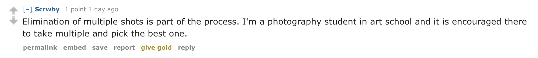
1. Good photographers shouldn't take too many photos in the first place; then it will not be a problem.

2. I am willing to/I have to spend the time and efforts to pick from all the photos I took and edit them.
Why is this?
As I looked more into their answers, I realized that the reddit users who responded tend to be more experienced photographers! Unlike those who are just casually taking snapshots of life, these semi-professional or professional photographers either take fewer, high-quality shots, or spend a long time manually refining their photographs using tools like Lightroom. In other words, they either don't have lots of similar photos in their library, or do have a lot, but consider it necessary to go over them one by one to make sure they select the best photos and post-process them.
Therefore, it seems like more professional photographers fall out of my target audience. What about more casual photographers, who just use cameras to capture snapshots of life?
Interviews & Personas
With that question in mind, I drafted a couple of questions and started casually asking people around me about their habits of taking photos, and whether they encounter any difficulties organizing them as of now. I had the hypothesis that people who are more casual and less deliberate when taking photos will have frustrations cleaning their photo library and getting rid of similar photos.
My findings validated the hypothesis: when people are taking photos casually, they tend to encounter frustrations managing similar photos and picking the best ones.
As I expected, all the casual/semi-professional photographers agreed that it is normal for them to take a lot of similar photos, and that it is a pain for them to organize them afterwards because they 1) either want to select the best ones to share (on social media, with friends), or 2) need to clean up those photos to save storage space or remove clutter.
For more professional photographers, it depends on the person and the context. Some professionals avoid taking similar photos in the first place and have the ability to capture amazing shots on one click; others take lots of photos, but use more professional tools other than Google Photos to post-process photos.
However, professional photographers, especially those who do take lots of similar photos, are not always in their "photoshoot mode." When they do take photos casually, they'd still use their phones to compare and delete unwanted ones, and would run into similar problems as casual photographers do.
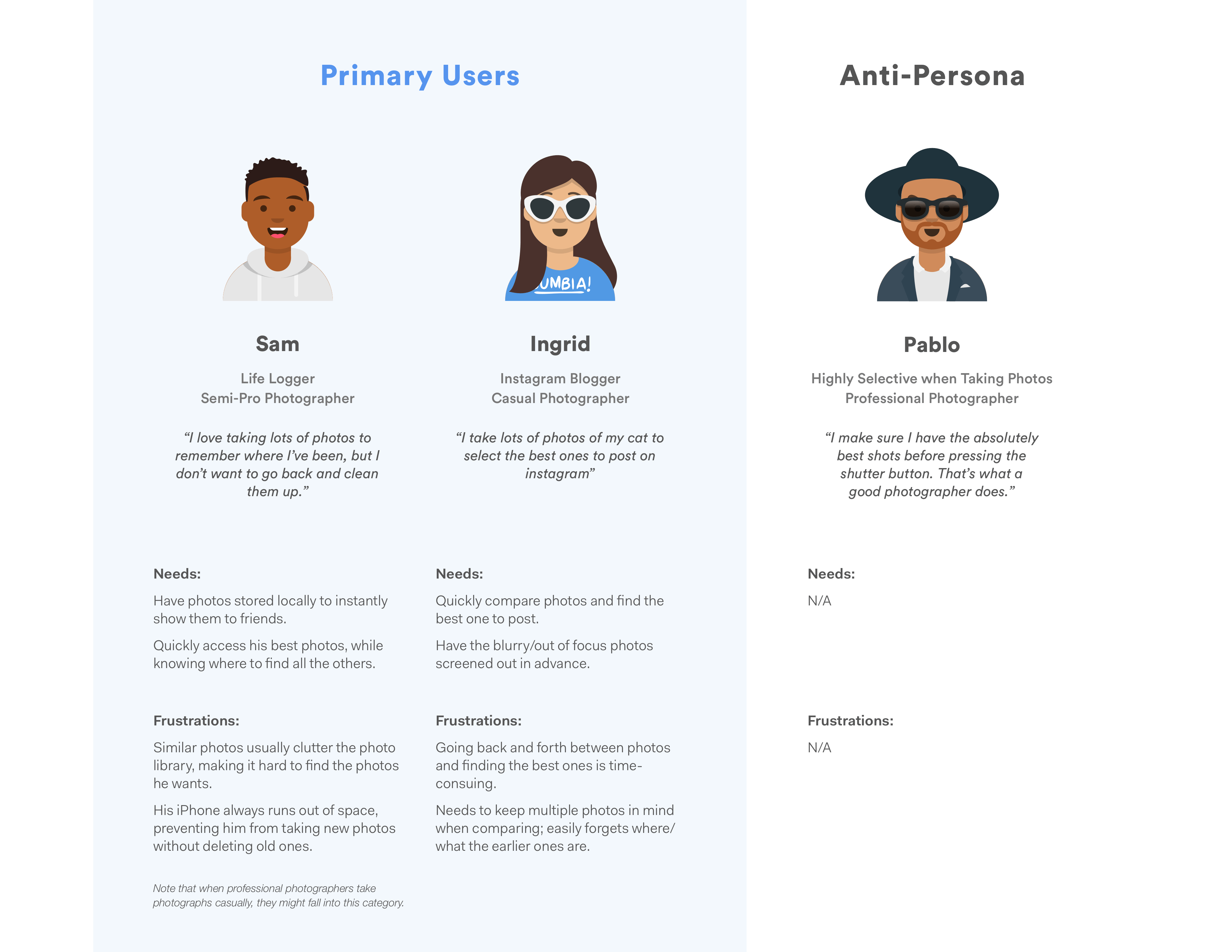
I then summarized the research and created the following personas to guide my design process. I also created an anti-persona to make sure that I remember who I am not designing for.
Design Goals
Based on the user needs and the gaps in existing products, I summarized the higher level goals I hope to achieve with the redesign.
Design
Having understood the design goals, I started brainstorming and developing ideas that can help me achieve these goals.
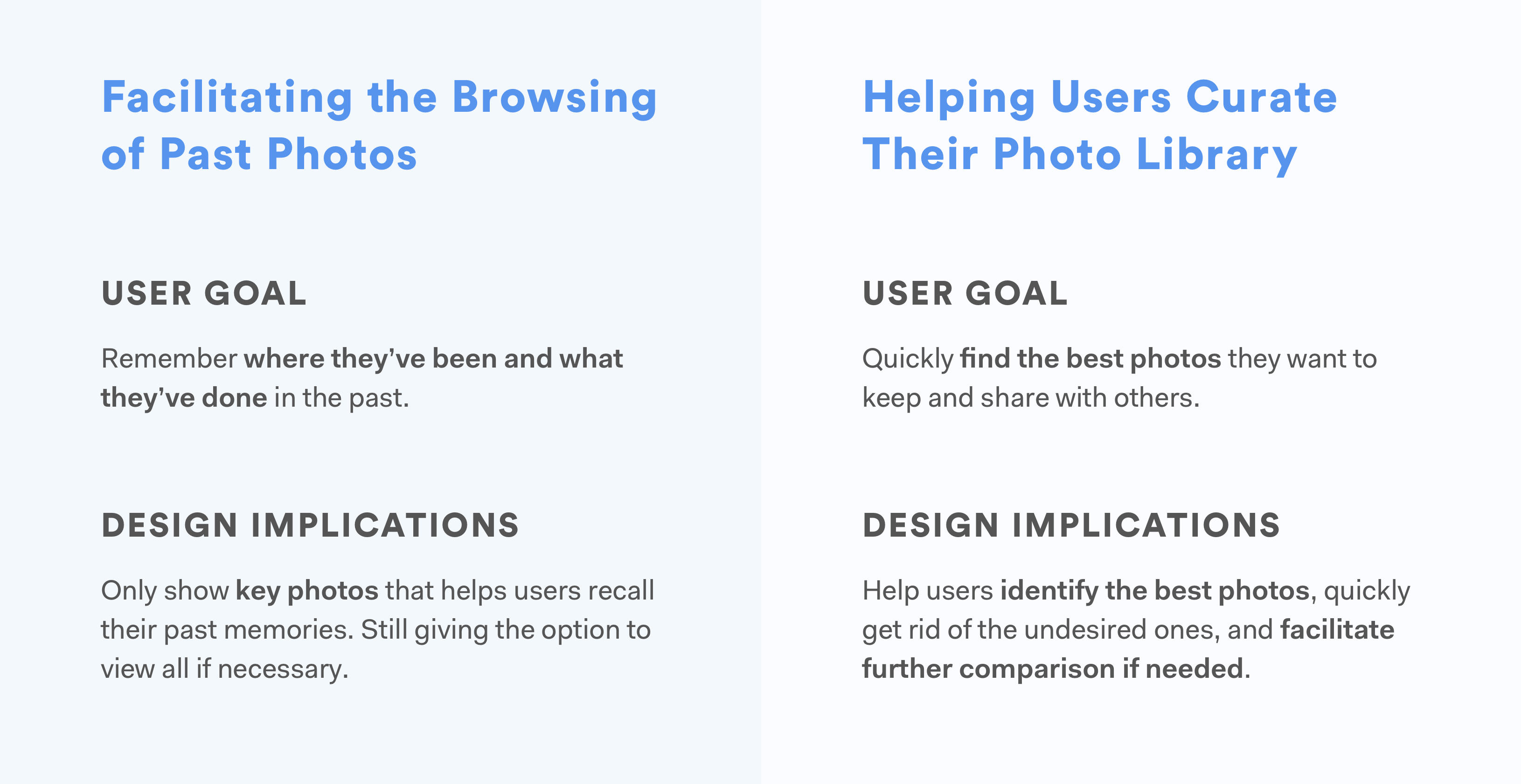
Facilitating the Browsing of Past Photos
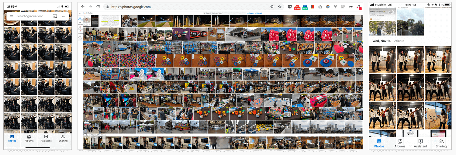
Right now, users see all of their photos laid out in the "Photos" tab, where similar photos take a lot of space and prevent them from finding the ones they need. From my user research, I learned that users don't necessarily need all those photos there, especially the similar ones. They just want to see the key photos that remind them of what they've done and where they've been. Only if they are interested do they want to see all the different photos related to that particular moment.
Where Should the Redesign Happen?
My first instinct was to redesign the "Photos" tab, but before diving into a redesign, I asked myself: can this problem be approached elsewhere?
Google Photos enables users to search for particular photos using natural language (e.g. Paris Summer, Dogs, Sunset, etc.). It also automatically creates albums for photos taken around the same time and place, and recommends them to users. Should I focus on these functions instead to better help users browse through their memories?
I referred back to what I learned from the user interviews. Most users I talked with spent most of their time browsing through photos in their "Photos" tab. Some do use "search", but only for searching specific photos. As for the automatically generated albums, users mentioned that those albums don't contain all the photos they took. Though the intention of those albums was to automatically include only the best photos for users, users still wanted to know that all the photos they took are there, and would prefer looking into the camera roll in the "Photos" tab.
Therefore, I decided that the "Photos" tab was where the redesign should happen.
Design Alternatives: Grouping and Expanding
One way to help users quickly clean the clutter in their camera roll is to use Machine Learning algorithms to group similar photos and only display the best one on the main grid view. Users can look through the photos, click on a group that interests them, and see all the other photos in the group expanded, so that they can look into them in details.
Because of my technical background, I would always consider the feasibility of my design even when I don't have access to the project's engineers.
Two important questions about this design idea are 1) how to define "similar photos" and group them, and 2) how to define "the best photo" among a group of similar photos.
For the first question, Google Photos is already able to identify similar photos. Its Assistant feature automatically generates collages and animations from similar photos. For the second one, Google Photos is now able to automatically create albums and videos, and select unrepeated photos to put in them on its own. I'm not sure if those photos are "the best" ones, but they are definitely carefully picked from the existing photos. In addition, Google Clip does have the feature of automatically recommending a best photo from a video clip. Therefore, though the concept of a best photo is still highly subjective, I believe that the technology of selecting a "best photo" from a group of photos, accroding to some standards, should be available to Google.
With this idea in mind, I quickly drew out 2 alternatives and thought about the pros and cons.
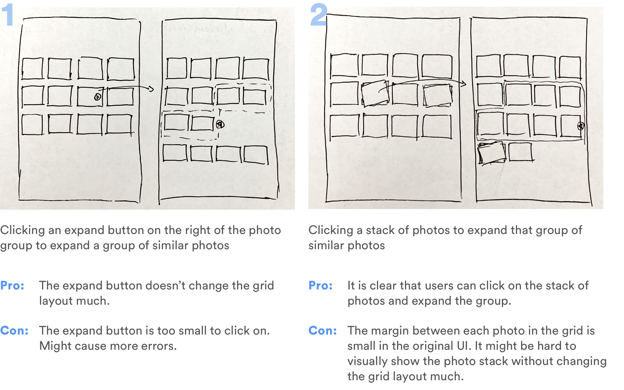
However, expanding a group on the grid layout means that the entire layout needs to be changed on click. It also means that users would need one more step to get to the photo they want. They would still need to select between similar looking thumbnails in the photo roll.
I then started asking myself: do users really need to see all those similar photos in the photo roll at all?
It seemed to be the convention to have all the photos displayed in the camera roll, at least in the expanded view; but as I referred back to the user needs and my design goal, I realized that this convention could be broken. The primary function of the camera roll is for users to quickly browse through and find/discover what they're looking for. There is no point of seeing several visually similar thumbnails there; users only care about how they differ when they can see the detailed image.
Therefore, I developed the third alternative.
I quickly drew out a wireframe and showed it to users to validate this idea.
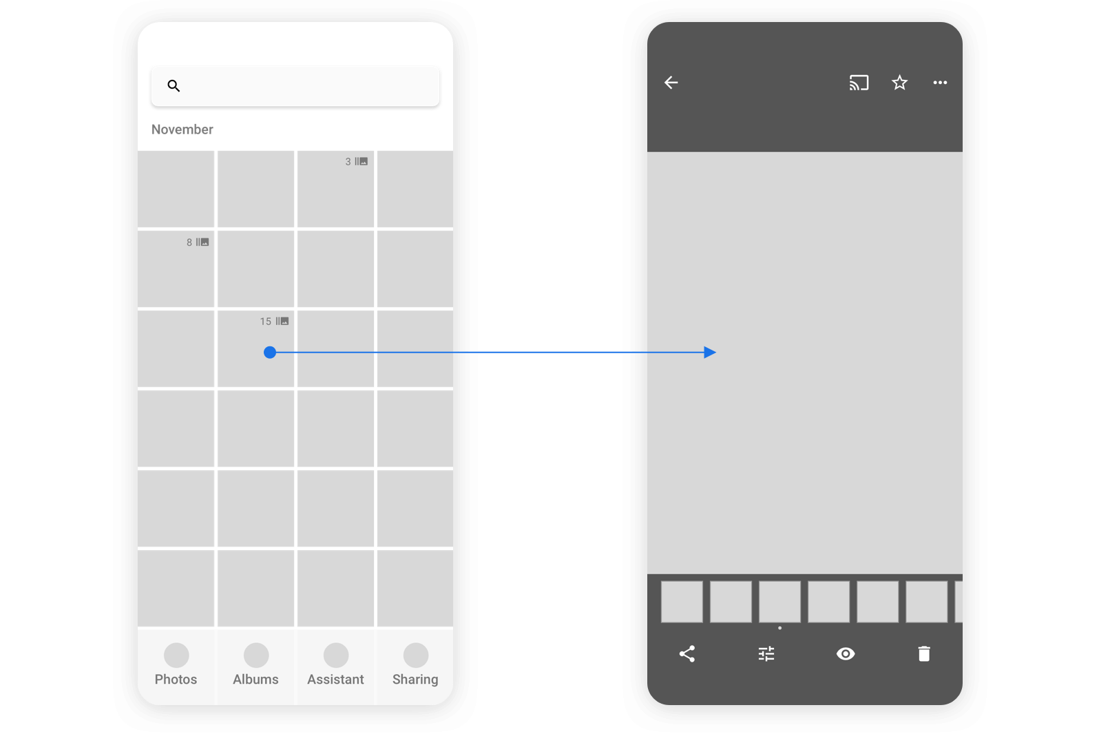
User Feedback: How to Identify the Most Important Moments?
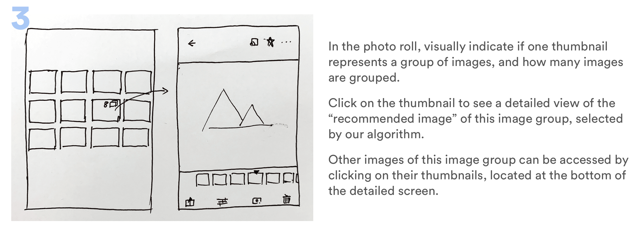
One feedback I received was surprising: some users say that sometimes having all the similar photos displayed in the camera roll actually helps them identify which moments were the most important. When they are quickly scrolling through the timeline, they'll stop when they see, for example, that they've taken 15 similar photos for one place they visited. That probably means that they spent a lot of time there, or that the place was special. Grouping all 15 photos into one single thumbnail loses that aspect, though it helps them clean up their photo library.
That was something I was not aware of before. Solving one problem might lead to the creation of another. Is there a better way to solve the clutter problem, while still having something to indicate the importance of a group of similar photos?
I quickly thought about 2 alternatives:
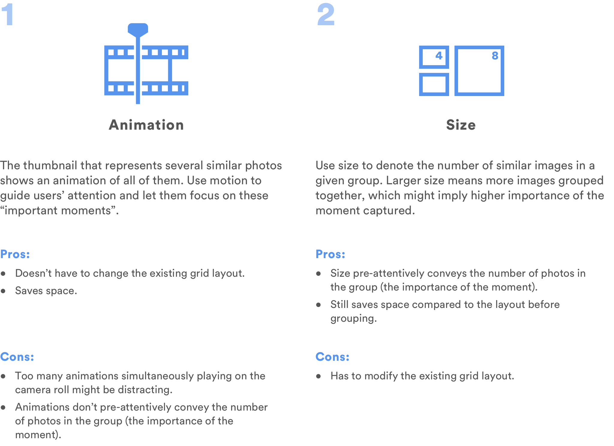
I decided that using size to denote the number of photos in a group would be a better choice because size encodes more useful information in a way that people intuitively understands: the larger the size, the bigger the number.
However, this means that we'll need to slightly change the algorithm of how the photos will be displayed in the "Photos" tab. If I had access to developers, I would definitely consult with them about this change, and balance the value the change brings with the amount of effort we need to put into that change.
According to my own understand of Google Photos' current grid layout, I started exploring how this change will affect the layout in different situations.
Grouping for Different Grid Layouts
The iOS client of Google Photos has 4 different grid layouts.
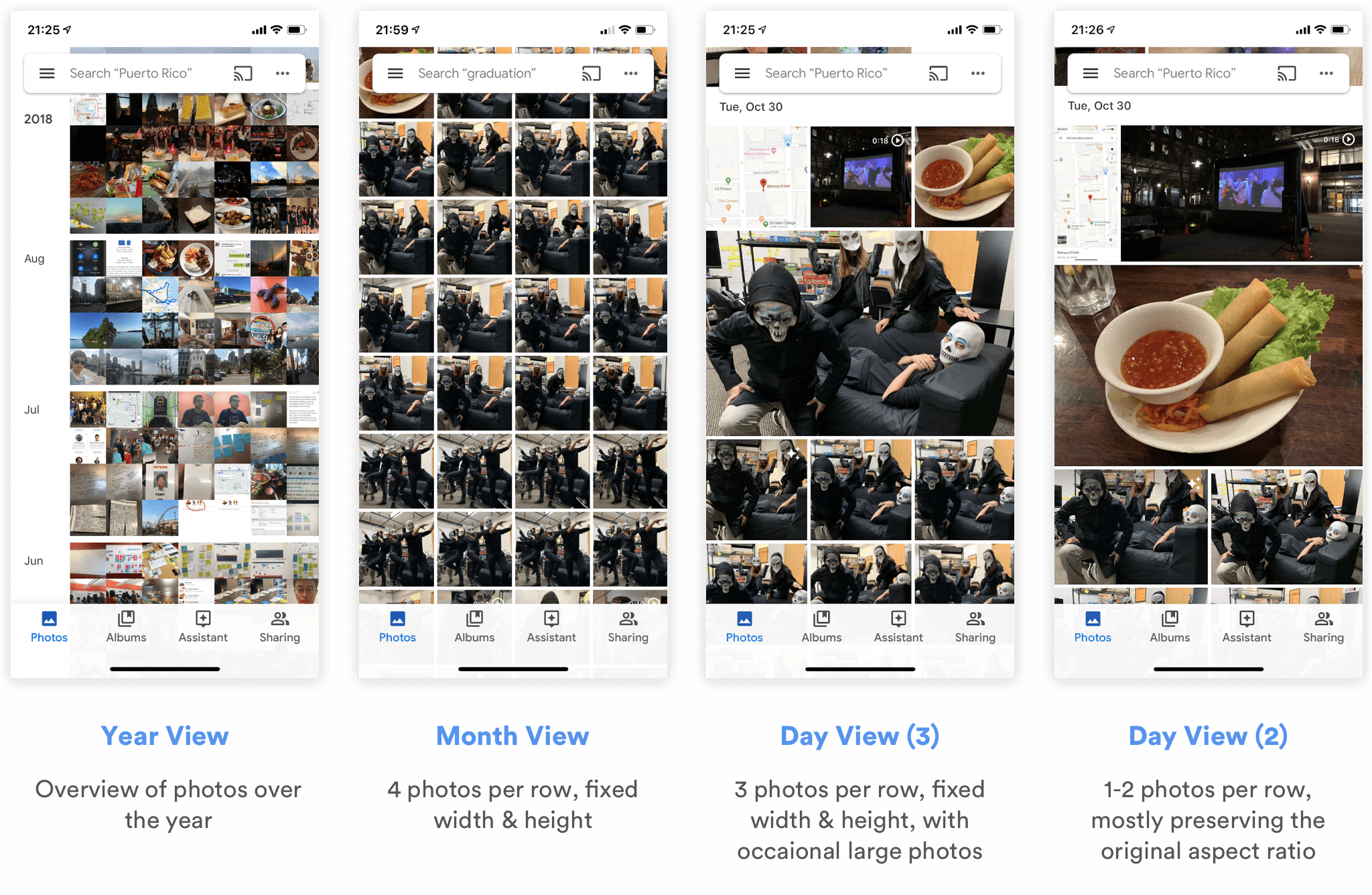
Obviously, there's no point of grouping thumbnails in the Year View, since it doesn't show all the photos to users. Therefore, I started thinking how I can group thumbnails for the other 3 views, and drew out the respective wireframes.
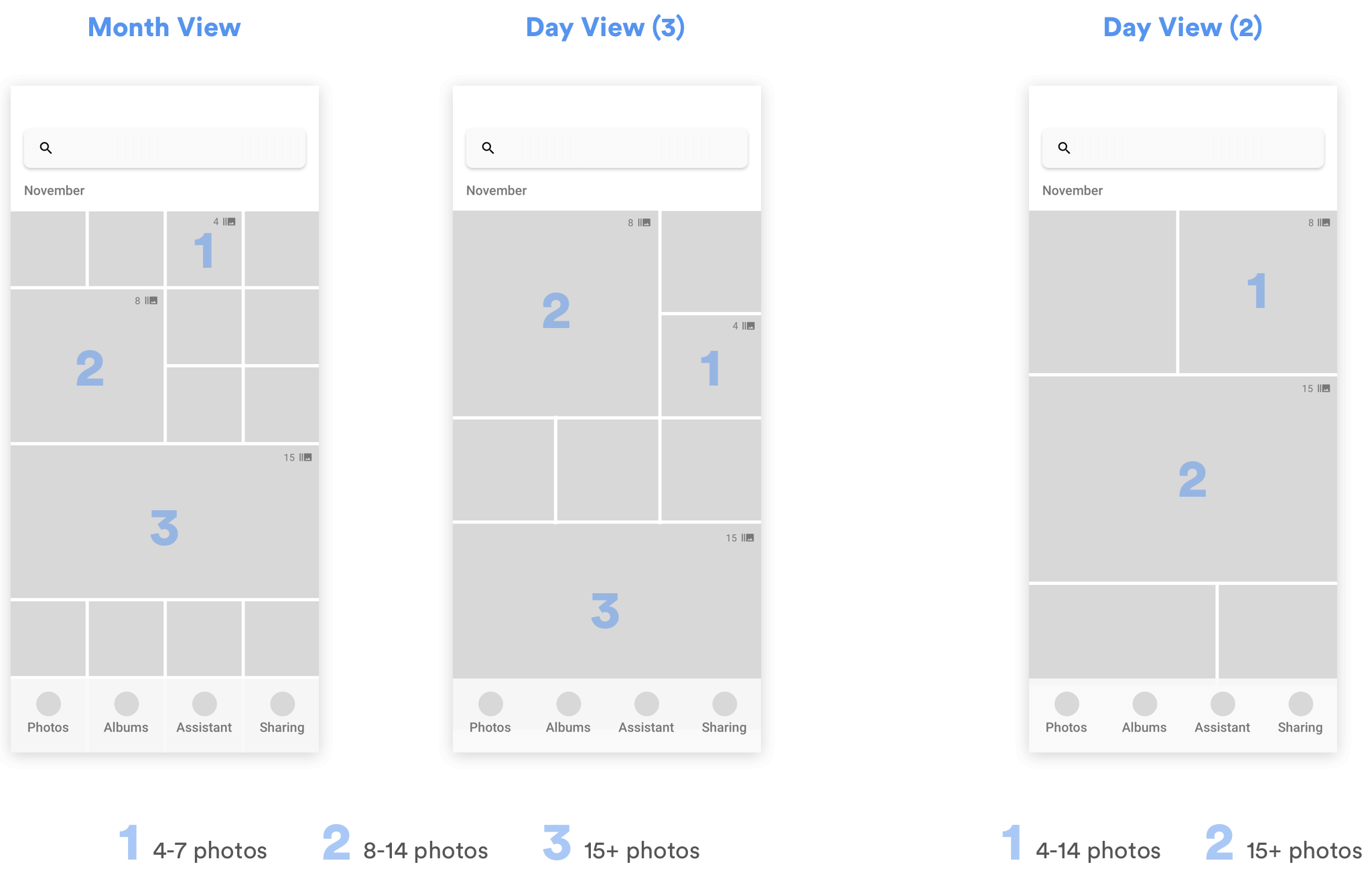
In Month View and Day View (3), since almost all photos are displayed in fixed-sized squares, I defined 3 different sizes for different numbers of photos grouped together. For Day View (2), since there are at most 2 photos per row, and the photo sizes differ depending on their aspect ratio, width and height, I only defined 2 different sizes to represent the numbers of photos in each group.
As for the actual thresholds for dividing the groups (e.g. whether a group of 7 photos should be of size 1 or size 2), I will need to talk with engineers to discuss the details and experiment with real data. It might also depend on the habits of different users.
How Will the Grouping Change the Way Users Browse/Interact with Photos?
After redesigning the grid layout in the "Photos" tab, what would users see after they click into a user group then? Bringing in the concept of "photo groups" means that I need to think more about 1) how users would navigate between photos in those groups, and 2) how the existing interactions with those photos might be affected.
For the first question, I referred back to user needs and put myself in the shoes of a user. Because of my limited time, I made an educated assumption that most of the times, users would only need to see one photo within each photo group as they swipe through their photo library. Only for photos that they're really interested in will they want to see all the other similar ones they've taken.
With this assumption in mind, I started thinking about alternatives for the interaction.
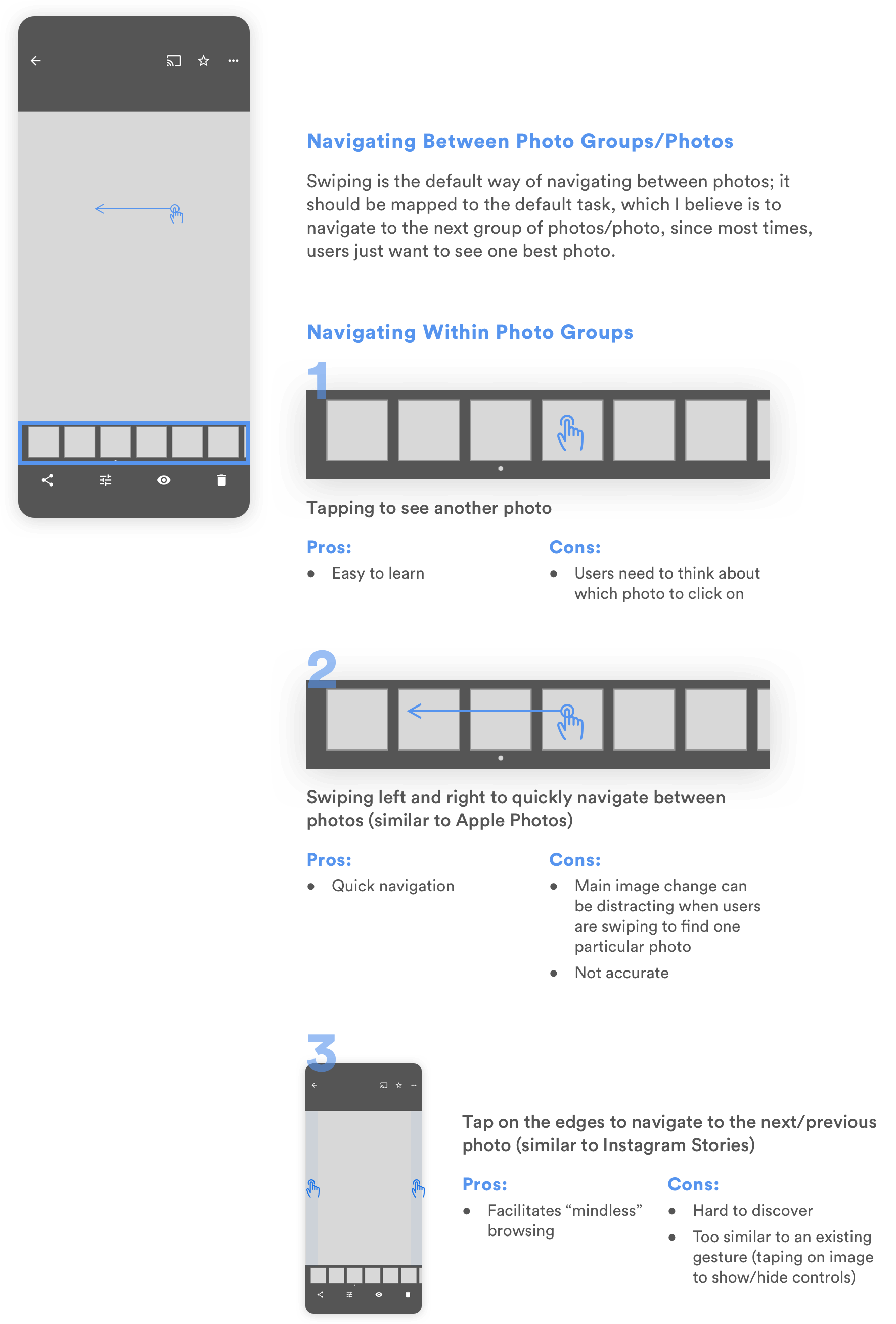
At first glance, alternative 2 seems to be the worst choice for comparison between similar photos, because it's extremely hard for users to keep in mind the photos they want to compare when the positions of thumbnails are constantly changing. However, since I later decided to create a separate mode for comparison, the sole purpose for users to navigate between photos in this page becomes to quickly browse through them. For this purpose, alternative 2 together with alternative 1 becomes the best choice. If I had time, I would bring it to users or other designers to get their input and validate this design decision.
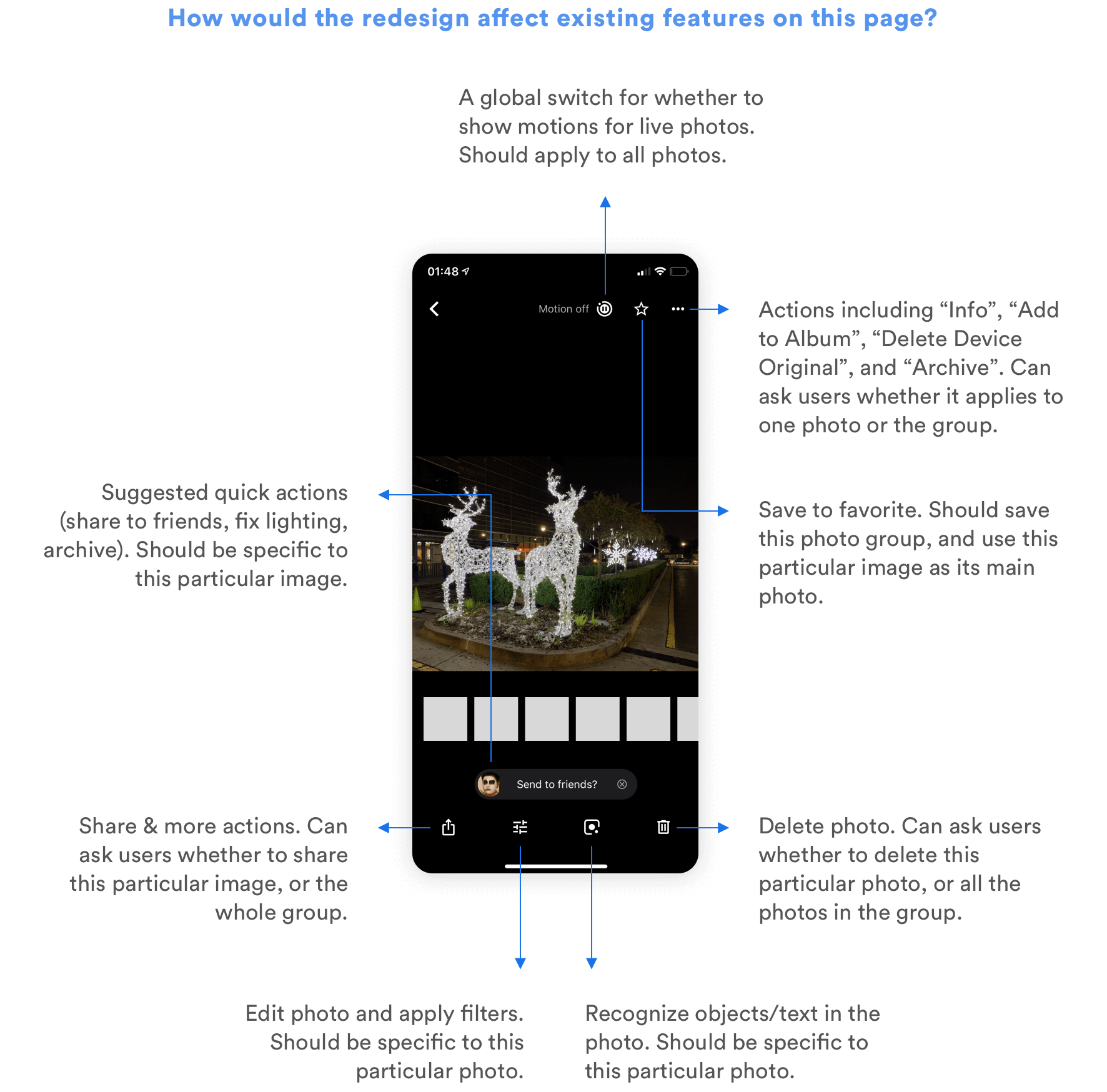
As for how the redesign is going to change the users' current interactions with photos, I explored all the ways users are able to interact with a photo right now, and thought about whether those interactions are more logical to be applied to a group of similar photos, or a single photo.
Helping Users Curate Their Photo Library
Another major task users usually need to carry out when they take lots of similar photos is to compare between different shots, delete the bad ones, or select the best ones to view, edit, or share. But this curation process is painful and time-consuming because 1) users have to manually go through every photo to pick the good and delete the bad, and 2) it is extremely hard to compare between similar photos and spot the differences. How can I make the curation process easier?
Using Machine Learning to Recommend the Best Photos
One way to relieve users from the burden of selecting the best photos is to suggest the best ones for quick actions. Using Machine Learning, it is possible to identify photos with the best lightings, compositions, and even those in which everyone's smiling. Google Clip has been using similar algorithms to suggest best moments in a video. It would be possible to further apply similar technologies in Google Photos to automatically suggest the best photo within a photo group, and enable users to quickly share it or delete the others.
However, the notion of "a best photo" is highly subjective. As a designer, I also want to give my users control even when my design leverages the most advanced algorithms to simplify the process. That's why I decided to provide another function to help them compare between similar photos more quickly.
Facilitating Comparison
Almost all users I interviewed complained that it is so hard to scroll through similar photos and compare between them. Here's how they do the comparison now:
As a psychology student, I didn't find this trend surprising. "Change Blindness" is something all people experience. Psychology experiments show that it is particularly hard to compare two slightly different images when they are side by side, or even when they are presented sequentially with a brief blank field in between.
Try identifying the difference between the following two images.
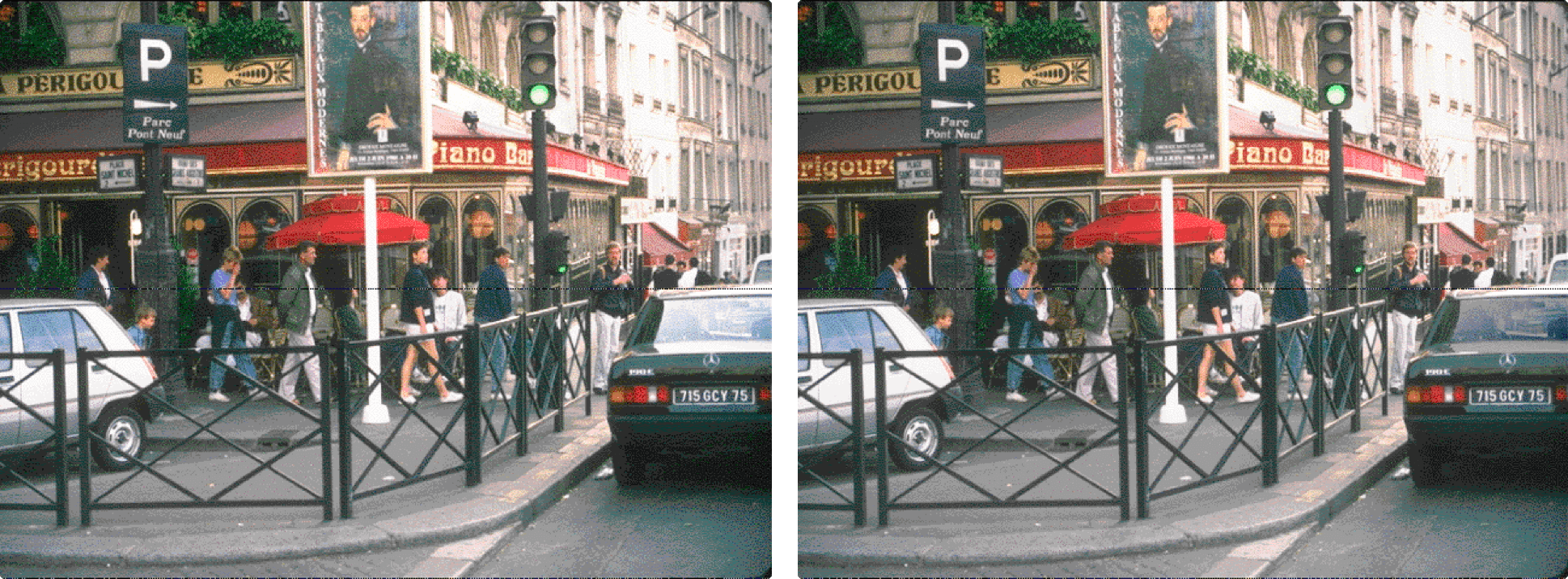
It's hard, right?
If side-by-side comparison is already difficult, then think about how hard it is to scroll and see slightly different images one by one, and try to compare the current one with another one you saw 10 seconds ago.
The quickest and the most effortless way to compare the differences between 2 images is to show them sequentially, with no interruptions in between, similar to how users can compare between edited images and original images in Google Photos, Apple Photos, and Instagram.
With these vague directions in mind, I started brainstorming and prototyping potential ideas.
Design Alternatives
Since it is hard to use paper or even clickable prototypes to illustrate how users can compare different photos, and whether the comparison method works, I quickly created the following alternatives in Principle and used real photos to illustrate the use cases. I walked through the usage scenario myself and showed the prototypes to others for feedback as well.
1
Enable users to double click to pin one photo to the top, and compare other photos with it. Can only perform actions (favorite/delete) on the current pinned photo.
Pros:
- Helps users decide whether the current pinned photo is worth saving.
Cons:
- Click to compare and double click to change/pin photo doesn't fit with user's mental models.
- Cannot quickly favorite/delete other photos unless they're pinned.
2
Enable users to pin one photo to the top, and compare other photos with it. Can quickly favorite/delete other photos by dragging them to the corresponding spot. Can swipe left/right on the top to change the pinned photo.
Pros:
- Helps users decide whether the current pinned photo is worth saving.
- Can perform quick actions on other photos.
Cons:
- The dragging action might be difficult to discover or learn.
- Cannot quickly pin another photo (need to swipe all the way to find it).
3
Enable users to normally browse all the photos, and compare them to a benchmark to decide whether to favorite or delete.
Pros:
- Fits users' existing mental model (swipe left/right or click on thumbnail to navigate between photos)
- Helps users decide whether the current photo is worth saving.
Cons:
- More steps to favorite/delete a photo compared to the second approach.
Among these 3 approaches, alternatives 1 and 2 are similar since they introduce the interaction of clicking on a thumbnail to compare the clicked photo with a pinned photo. Alternative 3 approaches the problem from another angle, enabling users to browse through the photos naturally and compare with a benchmark if needed.
Some of the shortcomings of alternatives 1 and 2 can be resolved by merging the two. We can use most of the interactions in alternative 2 and make the following change: instead of letting users double tap or scroll to pin a photo, we can let them drag a thumbnail up to pin it on the screen.
Eventually, I still decided to further develop the 3rd alternative, because it doesn't require users to change their habits much. Considering the large user base of the app, it might be hard to let all the users of Google Photos quickly learn the interactions in alternative 2, though once learned, it might be more efficient. However, if I had more time, I'd definitely gather more user feedback, or conduct A/B test to decide on the final interaction.
Separate Mode or Not?
I had the option of directly adding the comparison feature to the photo details page, or creating a separate "Compare Mode" to better help users compare photos. I decided to create a separate mode for it for the following reasons:
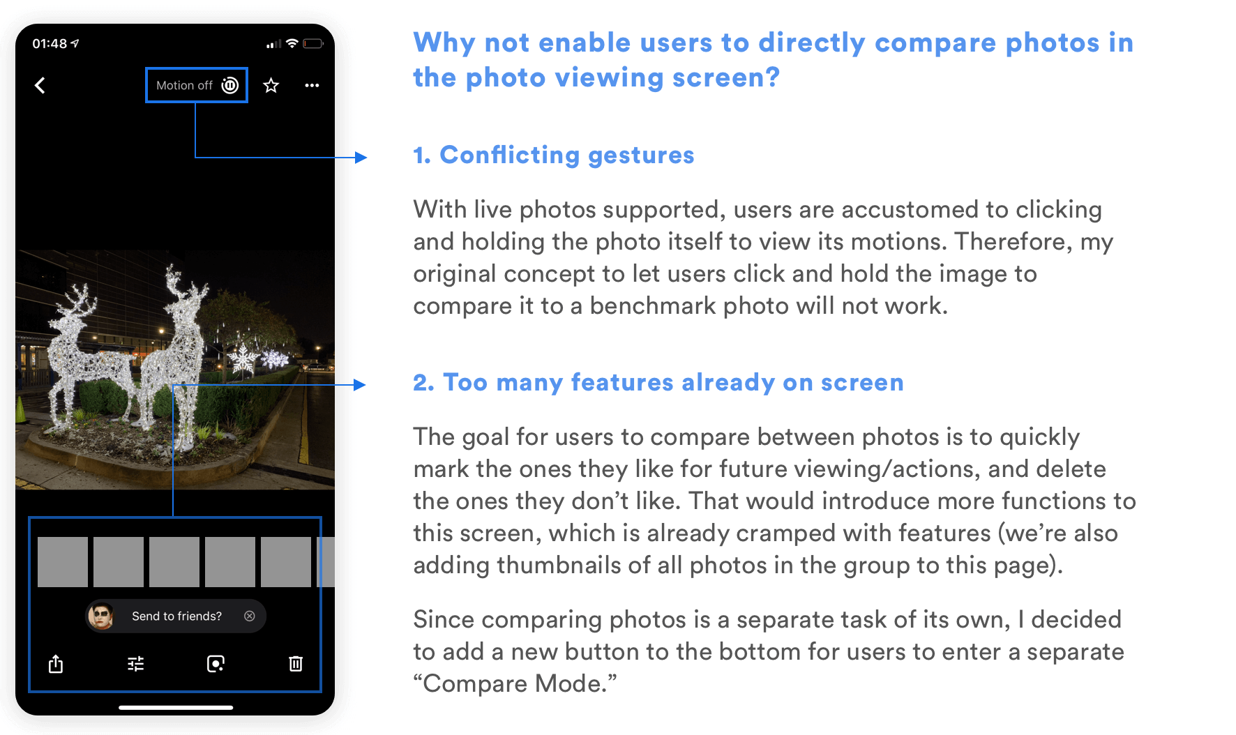
High Fidelity Design
With all the different components in mind, I started diving into details about how I can link them together into a meaningful flow. Again, I used the user tasks to guide my reasoning throughout the process.
As for the visual design aspect, I kept it consistent with the style of Google Photos, following material design guidelines.
User Flow & Prototype
Functions in Use
01. Browsing Past Photos
Similar photos are automatically grouped in the camera roll. The users will see all the photos in the group when they click on it, and will be able to navigate around by clicking on the thumbnails and the bottom. Swiping left and right navigates to another photo group/photo, while tapping on the left/right edge navigates to the next/previous photo within the group.
02. Comparing Photos
The best photo recommended by the system is already indicated with a dot. Users can tap on the "Photo Group" icon to enter compare mode. For each photo, they can click and hold to compare it with the pinned photo, which is the recommended one by default. They can then select ones they like, and delete ones they don't like immediately. When they finish, they can either delete all unselected photos, or save the selected ones separately to the library for further actions.
03. Managing Photo Groups
The Machine Learning algorithm might not always put the right photos into Photo Groups. When the Photo Group doesn't make sense to users, they can easily add photos or remove photos from the Photo Group, or even delete the grouping completely (not yet shown in the prototype).
Future Steps
Technical Details for Grouping
One of the key functions that determine the success of the design solution is grouping similar photos. But how to define "similar" photos? What's the boundary between one photo group and another, if they're all taken around the same time, with similar peoples, at the same place? There are lots of different use cases for why people would take photos and upload them to Google Photos, which means that we'll need to consider all of them if we're going to change the existing product.
If this were a real project, I would definitely start working with engineers from the inception of the grouping idea to make sure that we train the Machine Learning algorithm the right way and consider different edge cases.
In addition, photo groups contain different numbers of photos, and are displayed using different sizes on the camera roll. How do we segment the numbers and map them to different sizes? Should a 16-photo group take up a 2x2 grid or 4x4 grid? Will this differ according to users' habit for taking photos? This is also something I need to discuss with engineers and see the real user data to make a final decision.
Evaluating the Design with Users
Due to the time constraints, I wasn't able to bring the design alternatives or the final design to real users for structured feedback, though I tried my best to casually show them to people and hear their thoughts on them. There are a couple of questions I mentioned earlier that I hoped to further understand if I had more time:
- Do the different ways of navigating between photo groups and navigate within a photo group make sense?
- Is the alternative I chose for photo comparison their preferred way to compare? Would they prefer another alternative that challenges their existing behaviors but brings more convenience?
- In a photo group, would users understand which actions apply to the entire group, and which ones apply only to the current photo?
- Do the concepts of pinned photo and recommended photo make sense? Should they be one concept or two?
In addition to answering these questions, I'd like to develop a plan to evaluate the success of my design and identify usability problems. Given the large user base of the app, I might also gradually push the change to part of the users for A/B testing if that's possible.
Integrating with Existing Features
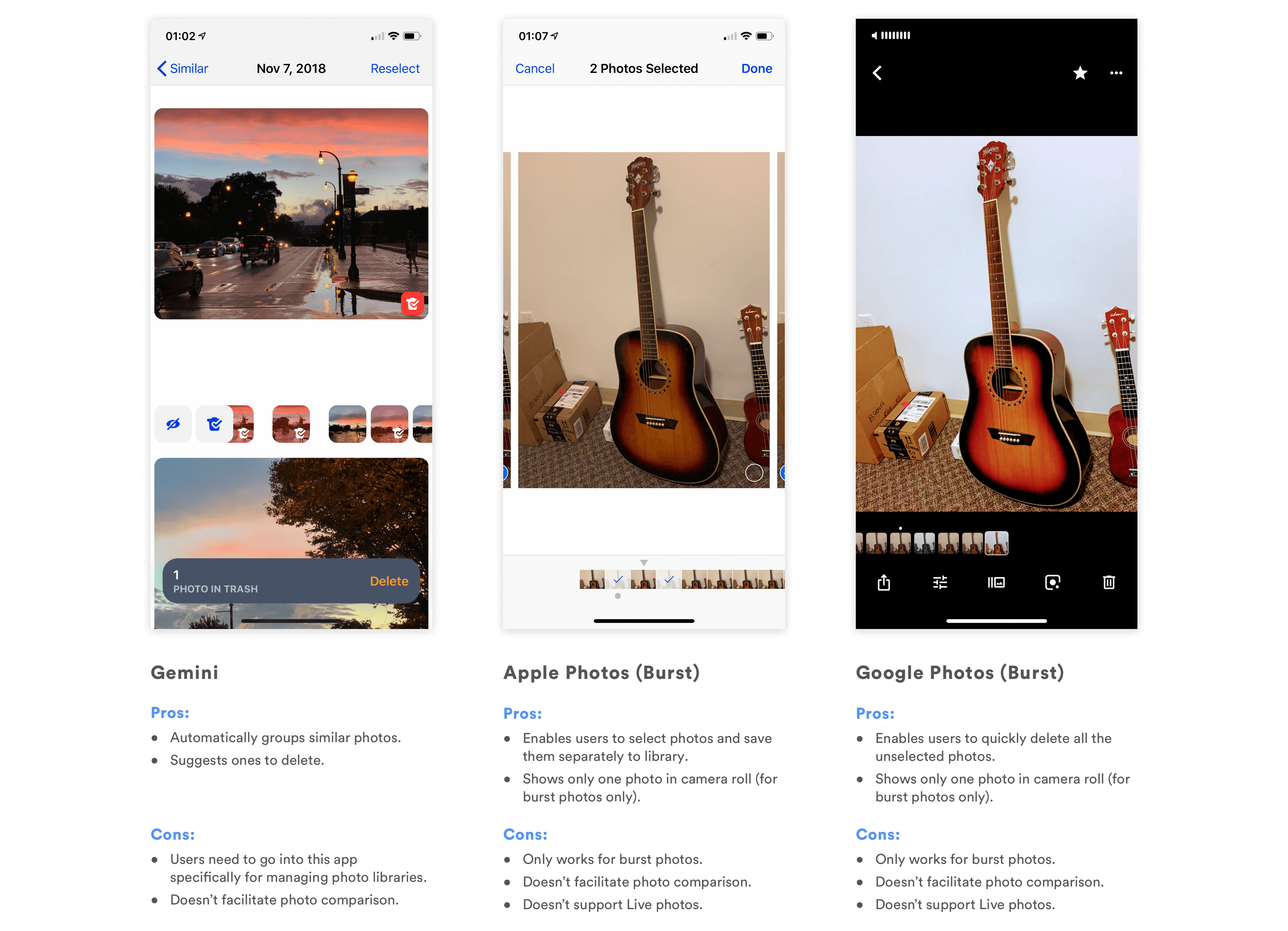
Adding a new feature to an existing product means that the feature doesn't stand on its own and must fit with the product as a whole. Some existing features in Google Photos that are related to the redesign include Burst Photos and Top Shot in Pixel 3.
Burst Photos
Google Photos already groups Burst Photos into one group and allows users to set a key photo and delete the rest. However, the functionalities are limited to Burst, so the use cases are different. Right now, I'm using a different icon to signify Photo Groups; however, since grouping similar photos and grouping burst photos are similar concepts, I might think further about whether it makes sense to distinguish them, and if not, how to merge these two functionalities into one that fits both use cases.
Top Shot in Pixel 3
Google's Pixel 3 has the Top Shot function, which automatically takes several photos for users on one click, and recommends one to users afterwards. This function is approaching people's problem of having too many similar photos from another angle--if the phone automatically takes a number of photos and selects the best, then the user won't need to take a lot of photos of the same thing in the first place as a fail safe.
However, I believe that the grouping function is still necessary because 1) Top Shot is only available on Pixel 3, not on other smartphones or cameras. It might take a long time for people to stop taking multiple similar photos even after functions like Top Shot becomes commonplace. 2) Even then, people would still like to experiment with slightly different angles and lightings when taking photographs. That's a use case in which we still need to help them group similar photos afterwards.
There are several similarities between Top Shot and Photo Groups, and both are related to Google Photos. As a future step, I'll need to think about how to make their interfaces/interactions consistent.
Extending the UI to Other Platforms
Google Photos is cross platform on iOS, Android, and Web. Adding this feature means that I'll need to consider how it will change the UI in other platforms, for different screen sizes.
What I Learned
Considerations for Redesign
This is my first time redesigning an existing product with a large user base, and adding a new feature to it. It pushed me to think deeply about how the new feature will change the app's existing flows, interactions, and even the logic behind them. For example, by introducing Photo Groups, I needed to think about how each function that used to be applied to only one photo would be applied to a Photo Group.
I tried my best to not disrupt the existing functionalities that make sense for the users, so that while they are using the app for other purposes, they won't notice the functionality change.
Because of the large user group, for the interactions inside the new functionality, I still made more conservative choices to choose those that fit better with users' existing mental models. I'm not sure if this is the best approach for redesigns, so I'd love to learn and discuss more about it!
Capturing Creative Ideas
I learned about the importance of capturing creative thoughts in an interview with IDEO's Tom Kelley. I also learned before that sometimes, creative ideas just come to mind at unexpected times as long as you've thought about the topic enough.
While I was doing this project, I made sure to always capture any idea that comes to my mind, regardless of their quality, on my Notes app. Travelling during the Thanksgiving break also gave me down times to let my mind wander and generate new ideas. I'd then find a time to sit down, look through them and build on them. Several of them ended up in the final design of the feature. I'll keep on doing this for my design in the future.
Yayyyyyyyyy you made it! Thank you all for reading through this case study! Hope you enjoyed learning about my design and thought process. As I said, this is my first time redesigning an existing app with a large user group, so I'd love hear your feedback and learn from you! :)