Overview


Problem

International students experience lots of difficulties ordering in ethnic restaurants in the U.S.. Even the most common terms like "quesadillas" or "lasagna" sound foreign to them due to lack of prior exposure. A lot of them feel embarrassed and frustrated visiting ethnic restaurants, and end up not exploring the diverse cuisine option available in the U.S..

Problem Framing

Solution

We designed Eatxplore, a mobile app that empowers our users by providing personalized dish recommendations and reviews to them based on their own ethnicity and the cuisine of the restaurant. It also enables users to quickly see the dish/ingredient name in their own language, and alerts them of potential dietary constraints based on the dish's ingredients.

My Role

UX Design/Research Lead

Timeline

Jan. 2018 - Apr. 2018
Refined in Sept. 2018

Team Members

Tony Jin, Danrui Sun, John Baek (Developer), Victor Kim (Developer)

Tools

Balsamiq, Sketch, InVision, Framer X


Tailored Recommendations
Whether you want something familiar or something new, we’ve got you covered.

Eatxplore recommends dishes based on the your own ethnic background as well as the cuisine of the reataurant. Whether you want to be adventurous or conservative in your choice, you can find the right recommendations to quickly get you started.

Dish Details at a Glance
All the information you need to make an order decision, at one place.

Want a quick overview of all the ingredients? Don’t know whether the dish meets your dietary needs? Can’t pronounce the dish name? No more Googling. You’ll find everything you need in Eatxplore at a glance.

Available for All Restaurants
Instantly get photos and translations for restaurants not in our database, with AI and Crowdsourcing.

If the restaurant is not in our database, simply take a photo of the menu, and we’ll provide you with a temporary translation of the menu, as well as photos for each dish to help you order. We’ll add that restaurant to our database thanks to your photo.

Our Approach

My Contribution

As the Lead UX Designer and Researcher on the team, I advocated for conducting user interviews, synthesis sessions and brainstorming sessions before arriving at solutions.

I led all the research & design activities with other engineers, created wireframes, high-fidelity designs, and interactive prototypes for user feedback & testing. I created the concept video and led the presentation of the app during the Georgia Tech CIC competition.

After the group project finished, I refined the design on my own, conducted more testing sessions, and iterated on the design for learning purposes.

Research


Competitive Analysis

We first looked into the market to examine whether existing products can help international students better order in ethnic restaurants.

competitive analysis

competitive analysis

We found that:

  • Apps similar to Yelp and TripAdvisor contain restaurant menus and reviews, but the content is generally American-centric.
  • With dish & ingredient names in languages like Spanish or Italian, internationals who had no exposure to those dishes still cannot understand what each dish is made of.
  • Internationals can use translation tools like Google Translate or Waygo to translate dish names and ingredients, but these tools only provide a brief translation, with no additional information on the dish’s taste or quality.
  • People need to search for each word they don’t understand, which takes time and effort.

Therefore, we hope to create a tool that can tailor to the needs of internationals, to help them quickly understand what each dish is made of, and predict which dish they might like.

Interviews & Affinity Mapping

To better understand how international students currently order in ethnic restaurants and identify potential problems, I advocated for conducting user interviews first before diving into solutions. I also invited our developers to participate in affinity mapping sessions with us, so that as a group, we can brainstorm solutions based on our findings.


We interviewed around 10 people who have stayed in the U.S. for different amount of time, ranging from 4 months to 5 years. We found that:

  • Even those who have been in the U.S. for a long time struggle to understand dish names and ingredients in ethnic restaurants, and need to Google them one by one.
  • International students usually want to see pictures of the food, but that is not always available on the menu.
  • Some people want dish recommendations from those who have similar ethnic backgrounds as they do; others want recommendations from those who are familiar with the dish.
  • Some people have difficulties pronouncing dish names, which can be embarrassing in front of American friends.

Because of these difficulties, a number of internationals choose to stick to familiar dishes when ordering in these restaurants; others end up not visiting these restaurants at all, even when invited by their American friends.

Personas

To better guide our design and enable everyone on the team to empathize with our users, I further synthesized the interview results and came up with the following personas:

Personas


Design


Ideation

With our research findings and personas in mind, I invited our engineers and the other designer to brainstorm solutions together. I encouraged them to come up with as many ideas as possible without considering feasibility at this stage.

Mind Map for Ideation


We then went through the ideas and discussed their implementation feasibility. For example, creating a taste profile for each user based on the kind of dishes they like seems to be an excellent solution; however, the machine learning algorithm behind it would be too complex for our developers to implement within the time constraints. Therefore, we had to make a compromise and provide recommendations based on users’ ethnicity as our first step.

Eventually, we settled on the following core functionalities:

Main Features

Sketches & Wireframes

I quickly drew out sketches of these functionalities with the team to make sure that everyone's on the same page.


Sketches


We created the following wireframes and brought an InVision prototype to our potential users for feedback.

Wireframes


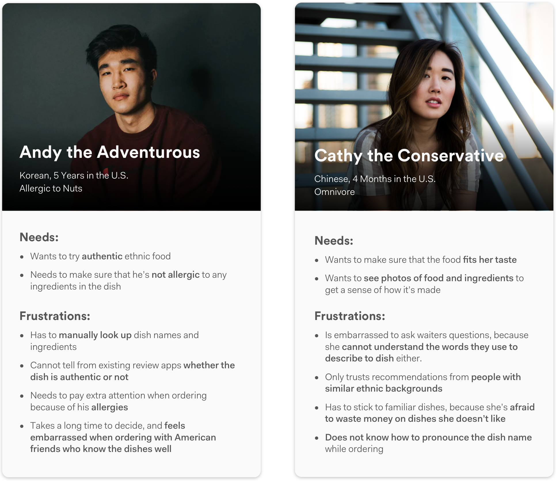
User Feedback & Revised Design Goals

All users liked the customized dish recommendations and the function to directly look up ingredient information. This was reassuring for us, since these two functions are our primary focus, and what distinguishes us from existing apps.

Avoiding Embarrassment & Empowering our Users

Some users were confused about ordering directly in the app, since it is not a convention for them to order in an app within a restaurant, especially when others sitting on the same table are still ordering by talking to the waiters/waitresses. They were also afraid that by being the only one ordering in the app, they would stand out among their friends and feel embarrassed.

Since the goal of our app is to help them feel less embarrassed while ordering in these restaurants, we decided to get rid of the ordering function, and focus our attention on helping them better communicate with waiters.

After talking with more users, we came to realize that one of our most important goals is to empower our users, who are not confident about how to order dishes right now.

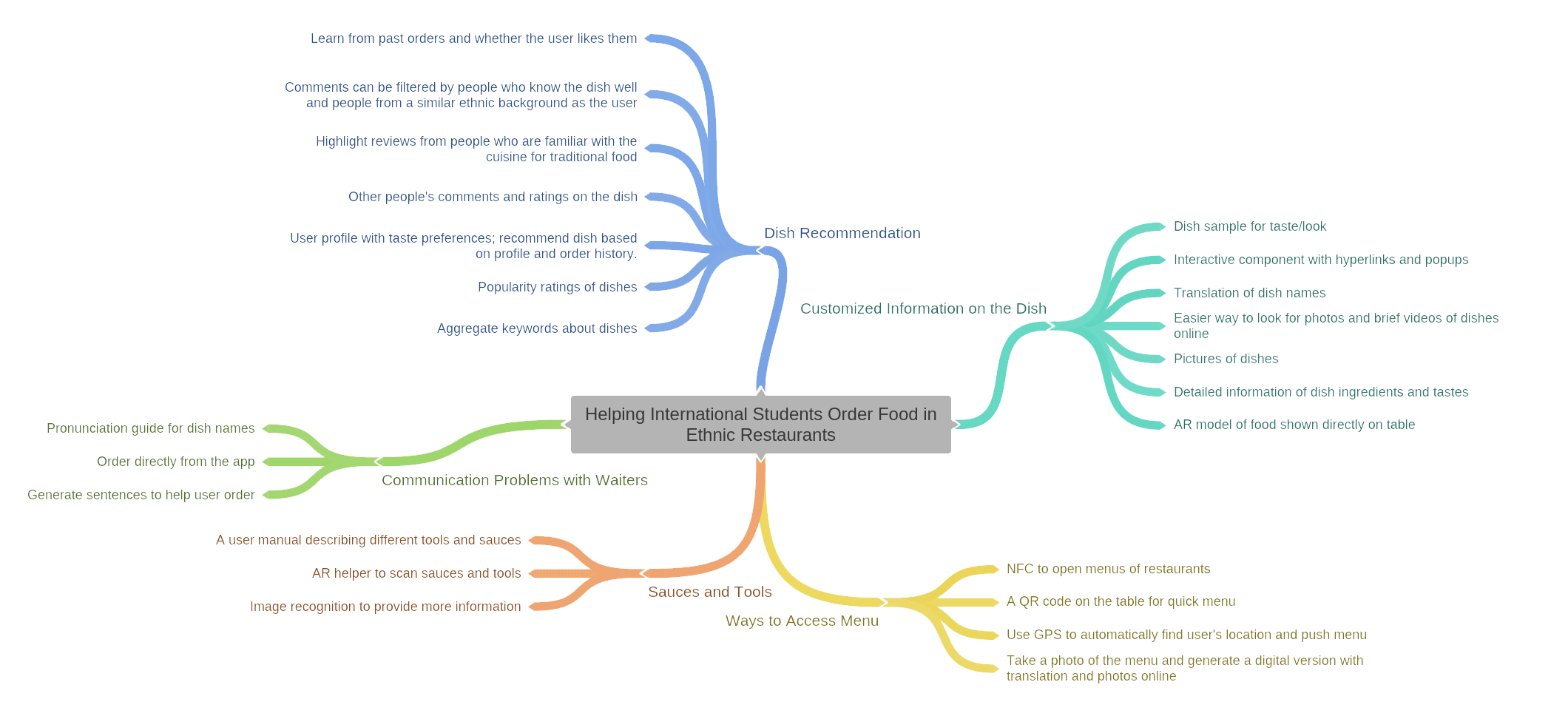
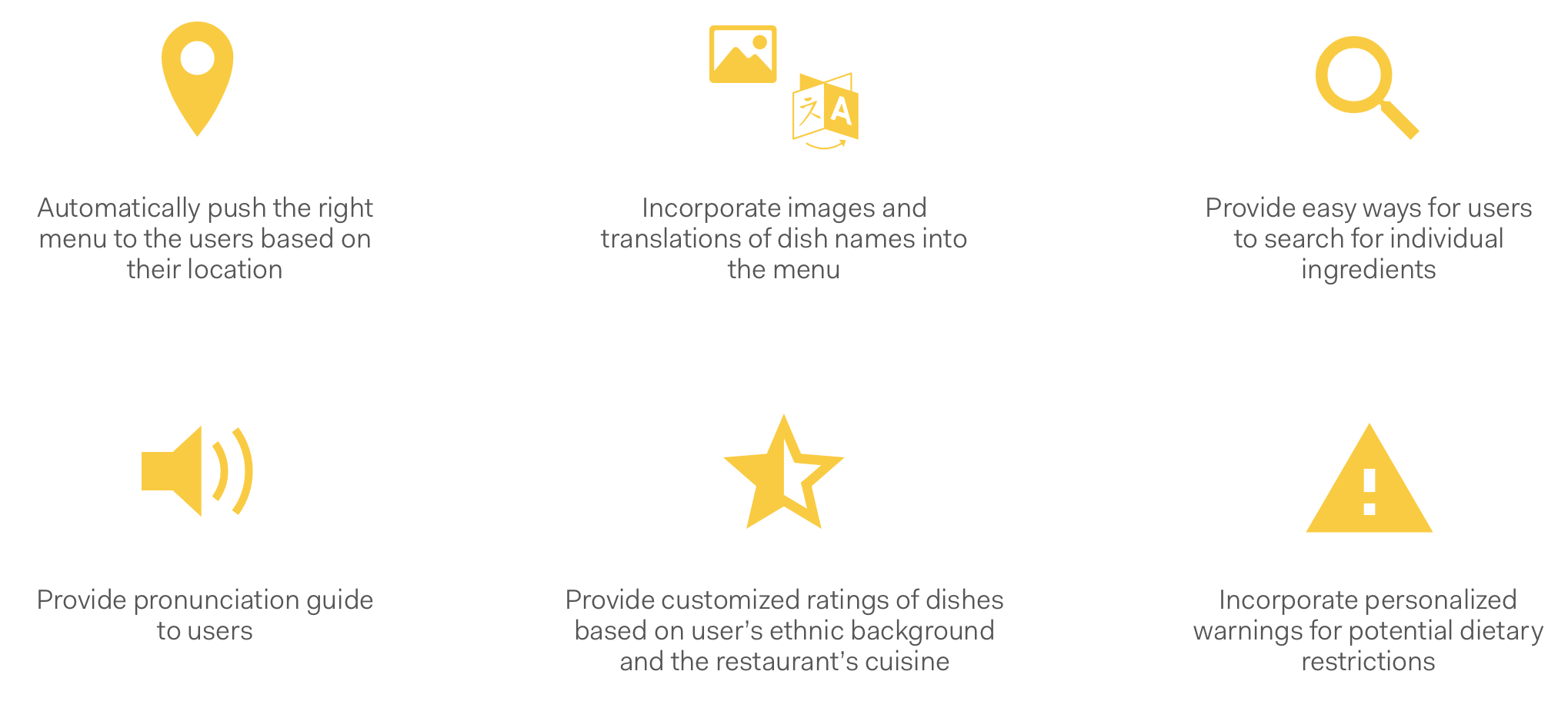
Refined Design Goals & Features

We refined our design goals and matched the features we hoped to implement to the goals we hope to achieve:

Main Features


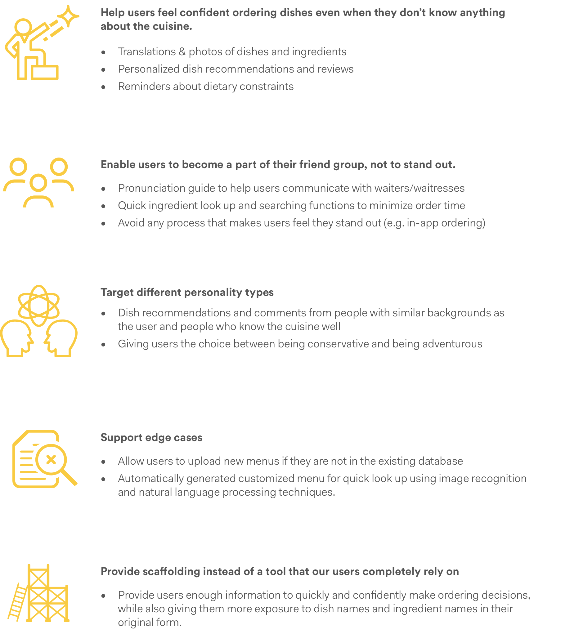
The rationale for the last point is that for the international student group we’re targeting, they usually know the English language well enough to live and study in the U.S.; they just have little exposure to the diverse cuisines in the U.S., and feel intimidated to get started. Therefore, instead of providing them with a tool that’s completely in their language, we hope to build something that’s primarily in English, with translations on demand. In this way, we hope that our users can gradually learn the terms they don’t understand, and rely on our tool less and less as they use it more.

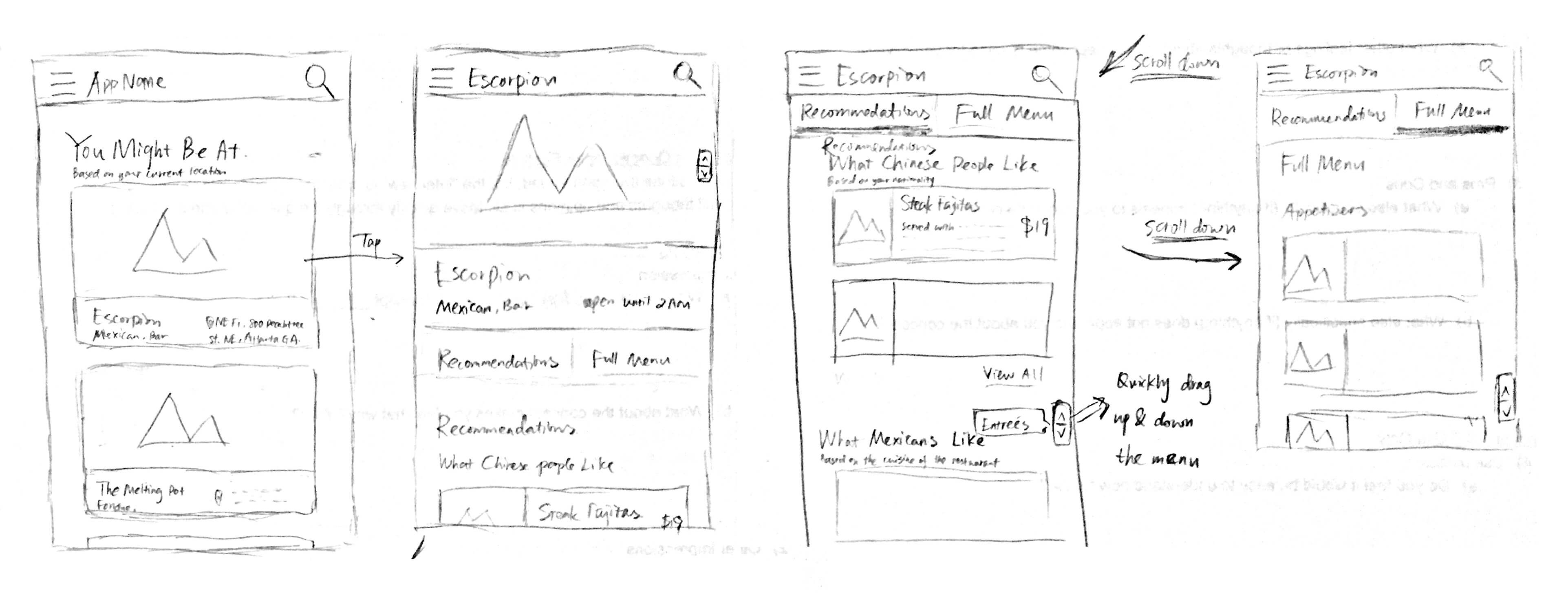
High-Fidelity Design - Iteration 1

For the first iteration, my primary goal is to validate whether the design helps different types of users be more confident, make ordering decisions faster, feel comfortable visiting ethnic restaurants and ordering in front of people who know the cuisine well, as well as learn the basic terms of different cuisines over time. I also hoped to test the usability of the design, so that I can improve upon it.

I used Sketch and InVision to create a basic interactive prototype to illustrate enough functionalities for me to test my hypotheses.

Hifi Design v1

Evaluation & Iterations


User Testing Process

With the goals I had for this iteration in mind, I moderated user feedback sessions with 5 users with different attitudes towards trying new food and different levels of familiarity with Mexican cuisine (the example I used in my prototype). Here's a brief overview of the process:

  • Introduce the project goal, and put users at ease.
  • Describe the scenario, set up the context, and let users use the app while thinking aloud.
  • Ask follow up questions and gather feedback.
  • Let users fill out a questionnaire. Thank them for participation.

Measuring Success

To quantitatively measure the success of the design, I broke down the larger design goals into detailed, measurable ones, and developed a questionnaire to help me answer those questions.

Evaluation Metrics

Results

I was able to gather a lot of positive feedback on the prototype, from users with different dietary constraints, different attitudes towards trying new food, and different familiarity levels with Mexican food. Here's a summary of how people rate their own ordering speed, confidence, comfortableness in front of friends, and frequency of future visits to ethnic restaurants, with the app available:


Evaluation Results


In addition, 5 out of 5 users believe that the tool will gradually help them learn about the common terms used in unfamiliar cuisines. All of them are also willing to recommend the app to a friend, believe that it is a meaningful alternative to existing apps like Yelp and Google Translate to help them order dishes in ethnic restaurants.

Feedback & Design Iterations

To learn about online design tools, I used Mural to organize each user's feedback, and grouped them by themes and features.

Evaluation Results

Different colored sticky notes represent feedback from different users. Notes with borders represent positive feedback.

Dish Recommendations & Menu

Instead of dividing recommendations based on users' ethnic background and the restaurant's cuisine, most users wanted to see recommendations based on all users' feedback, with the ability to apply filters as needed.

In addition, most users did not like the restaurant's name and the menu navigation controls at the bottom. My original intention to put it there was to allow users to easily reach the navigation with their thumb to quickly navigate through the menu. However, users either did not notice it, or noticed it, but expected to be able to drag it up. Since it is important to give users a sense of where they are in the app, I had to make the compromise and move the restaurant name and menu navigations to the top, so that users can notice them more easily.

Evaluation Results


For the detailed menu, most users expected to be able to quickly get enough information about a dish at a glance; this information includes the dish's ratings and whether it conflicts with their dietary needs. Users either did not notice or did not understand the current dietary conflict alert symbol, and wanted it to convey more information, such as what ingredients conflict with their dietary needs.

Based on user feedback, I made some visual design changes to make the menu more readable, and only show the most important information users expect to see.

Evaluation Results


Dish Details, Ingredients & Reviews

For the dish details page, again, users expect to have a quick glance at the page and decide whether they'd order this dish or not. They'd like to see more photos of the dish, and quickly understand what it's made of. The current design requires users to click into ingredients they don't understand to see their translations; futhermore, few users realize that the ingredients are clickable. Therefore, I added translations of ingredients on this page, and added signifiers to make it more obvious that the ingredients are clickable.

Steak Fajitas


Similar to my changes to recommendations, I changed the reviews layout to give users an overview of how people think about the dish in general, while giving them the ability to filter according to their own ethnic background and the restaurant's cuisine. Since users found the rating comparison between different ethnic groups informative, I put the ratings by different ethnic groups side by side to facilitate this comparison. Based on user feedback, I also added photos and helpfulness ratings to the review, and enabled users to write review in their native langauges.

Steak Fajitas


So far, I've only made changes to the main functionalities based on user feedback. I'm still working on redesigning other screens & functionalities, and I'll post updates to them as soon as I finish the redesign.

Latest Prototype


Here's the latest prototype with some of my updated changes. Further changes to the design based on user feedback will be posted soon.

Future Steps


Encouraging More Reviews

Our app's core functions rely heavily on users' reviews. However, the app is mostly needed when users are deciding what to order. How can we encourage users to open the app and review the dishes they ordered after they leave a restaurant, when they have no motivation to open the app? I listed three alternatives for solving this problem together with their pros and cons. Future research/testing is needed to narrow down to the best options.

Steak Fajitas


Gamifying the Experience

Since users are not ordering directly in our app, it is hard for us to keep track of what dishes they ordered, so that we can remind them to review those dishes, or to recommend them new ones based on their order history. One way to encourage users to log their orders is through gamifying the experience. As a future step, I'd like to explore whether collecting stickers for dishes, badges for reviews, and using a leaderboard to compete with friends can encourage users to log and review what they ordered.

Customizing Dietary Constraints

People's dietary needs differ a lot. In order to better remind people of potential dietary conflicts, I'll first need to create a comprehensive list of common dietary constraints, and map them to ingredients that might conflict with them. But that's not enough. Some users reported having specific dietary needs, such as not eating carrots, garlic, or ginger. To provide a more personalized experience, I'll need to enable users to select from a wide range of predefined dietary constraints, and customize them if necesssary.

Filters & Sorting Functions for Reviews

Right now, we've designed the essential function for users to filter the reviews based on their own ethnic background and the restaurant's cuisine. Some users mentioned wanting to only see 1-star reviews or 5-star reviews to get a wide range of opinions. Others wanted to sort reviews by different parameters (recency, helpfulness, etc.). I'll need to conduct further research to figure out the most important filters/sorting methods that need to be implemented.

Designing for Different Languages

So far, the app only demonstrates the use case of a Chinese customer visiting a Mexican restaurant. What if the user is Korean? German? Indian? It is true that words are usually shorter in Chinese compared to English. What if the user's language (e.g. German) contains longer words and looks visually similar to English? That would probably influence the visual design of the app. If I were to continue this project, internationalization will be one of the major challenges in the UI Design.